Typographics 2024
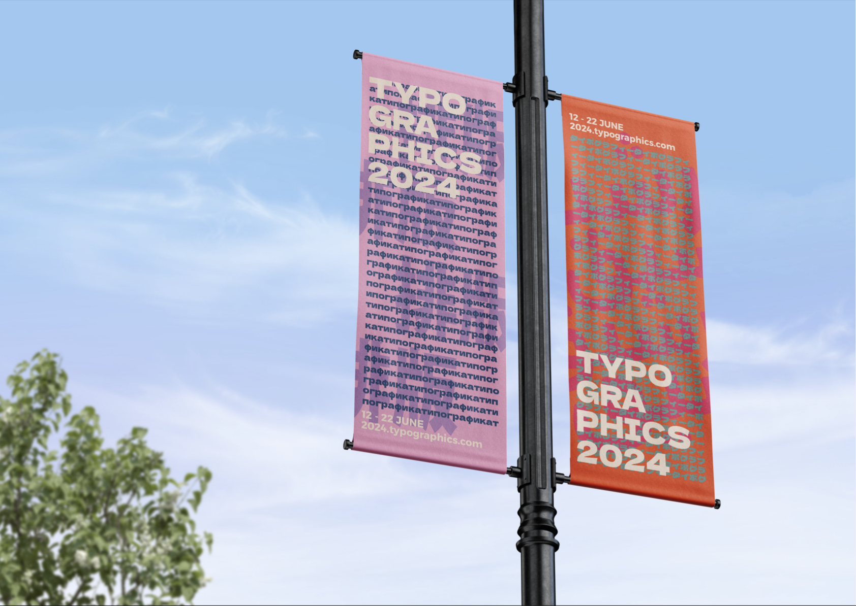
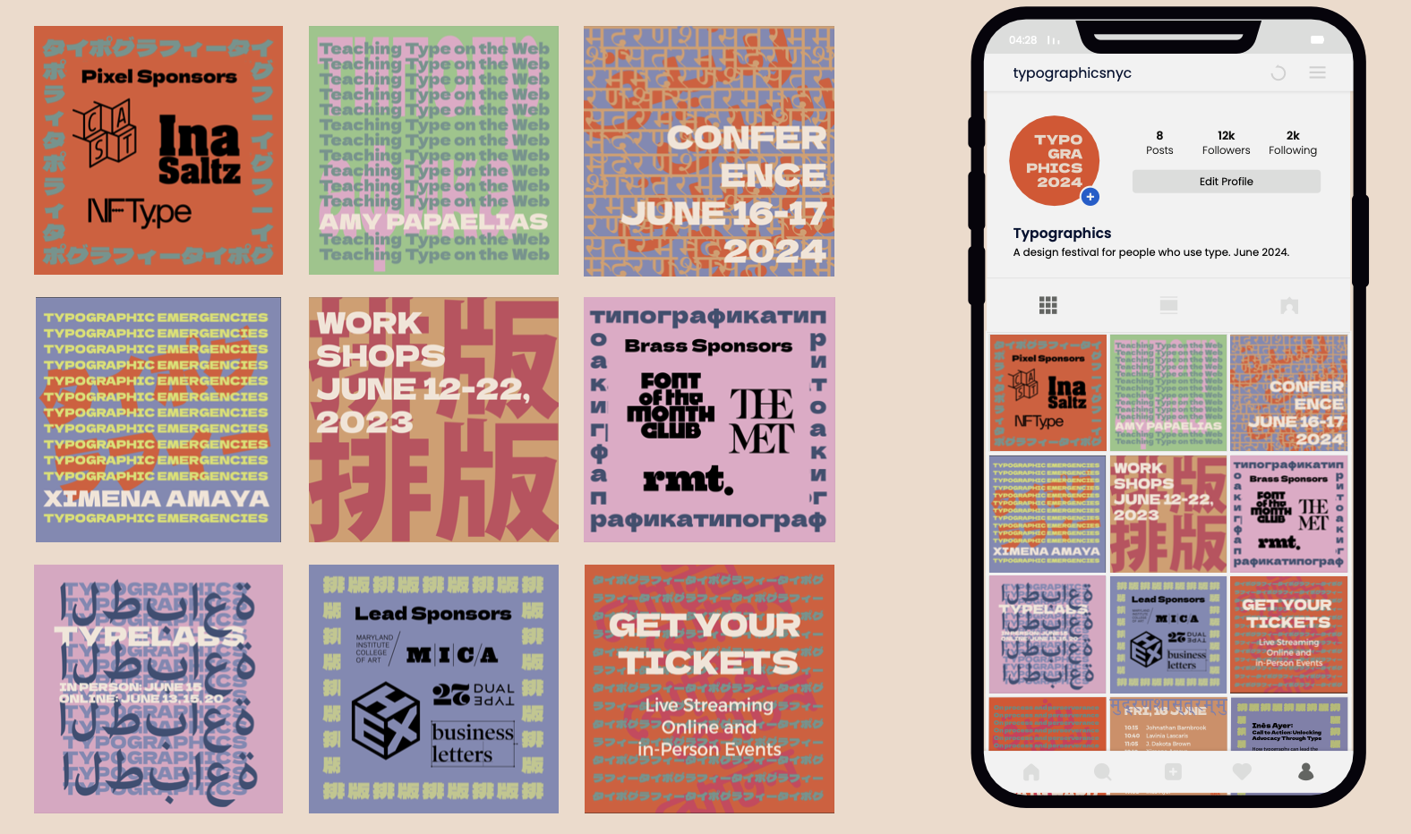
Our client is the Typographics 2024 festival, a design festival based in New York City and broadcasted online. The festival is a celebration of typography as a global experience, highlighting the rich diversity and fluidity of letterforms and their cultural significance. Thus, we developed a comprehensive brand solution utilising various languages. We aim to engage a broader worldwide creative audience, incorporating unique typographic expressions into the various branding materials including a website landing page, an A2 poster series, vertical flags, social media assets, a printed program and a typography style review.
Applications Used: Adobe Illustrator, Adobe InDesign
In collaboration with Stella Sinnott and Lucy Johnson.


All visual assets were required to be made of typographic elements. Dela Gothic One was selected as the primary typeface as the font was highly compatible with various different alphabets. Within our Typographics 2024 collateral, we utilise the Roman alphabet, Russian characters, Kanji (Japanese characters) and Chinese characters. These languages were selected as they are some of the most spoken languages across Asia and Europe, maximising our target audience.
Our secondary typeface was Montserrat. We selected this typeface because of its legibility and clean, modern appearance which compliments the characteristics of Dela Gothic One. Montserrat Bold is a suitable choice for sub-headings and Montserrat Regular for body copy. The simplicity helps communicate larger sections of information clearly and continually attracts attention throughout the collateral, particularly within the printed program.


To view the project in more depth, including the contents of the printed program and the style guide, please see the documents below:
